4RinEU has a logo
DYNAMIC, TRIANGLE STRUCTURE UNDER COMPLETION
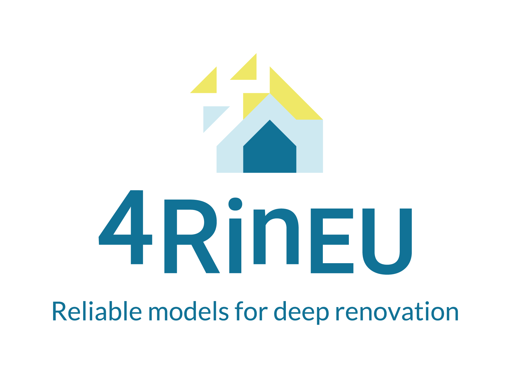
4RinEU new logo represents our project personality: competent, concrete, reliable.
It consists of 2 elements:
– the icon
– the wordmark 4RinEU.
The icon represents a structure in building process. Triangles are sturdy, they have a natural strenght which prevents from warping. Each of the three shape’s sides supports the other two.
Similarly, in 4RinEU project each package works in cooperation with the others, creating a strong and reliable strategy. The dynamism of the icon refers to the process, which is by meaning a series of actions bringing about a result.
This motion feeling is also transferred to the wordmark, obtained with an elaboration of Roboto letters.
Shapes and colours aim to communicate the values: different tones of blue, a calming & serene color to communicate competence & reliability. An accent of contrasting Yellow, to enhance enthusiasm & optimism.


